


Project Management
Project management is a complex and dynamic field that requires effective planning, coordination, and monitoring of resources, tasks, and objectives. In order to be successful, project managers need to have a clear understanding of project progress and performance, and be able to communicate this information effectively to stakeholders.
One of the most effective ways to do this is through data visualization, specifically through the use of charts and graphs. These visual aids provide a quick and easy way to understand complex data, identify trends and patterns, and communicate project performance to stakeholders.
What are the Benefits of Chart for Project Management?
Charts are a valuable project management tool because they provide many benefits, including:
- Improved Understanding: Charts help to present complex data in a visual format, making it easier for project managers and stakeholders to understand project performance and progress.
- Enhanced Communication: Charts provide a clear and concise way to communicate project performance and progress to stakeholders, which can help to build trust and ensure that everyone is on the same page.
- Better Decision Making: Charts provide insights into project performance and help project managers identify trends and patterns, which can inform better decision making and improve project outcomes.
- Improved Tracking: Charts can be used to track project progress and performance, which can help to identify potential issues early and take action to resolve them before they become major problems.
- Better Resource Allocation: Charts can be used to represent the distribution of resources, effort, and costs within a project, which can help project managers optimize resource allocation and reduce waste.
- Increased Transparency: Charts provide a clear and objective view of project performance and progress, which can increase transparency and accountability.
- Better Risk Management: Charts can be used to identify trends and patterns in project performance, which can help project managers identify potential risks and take action to mitigate them.
Overall, the use of charts in project management can lead to improved understanding, communication, decision making, tracking, resource allocation, transparency, and risk management, all of which are critical components of successful project management.
In this blog, we will take a closer look at the top 10 most popular charts for project management, and discuss the benefits and uses of each.
Top 10 Project Management Charts
Gantt Chart
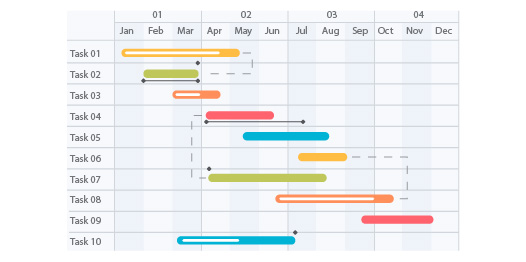
The Gantt chart is a type of bar chart that is used to represent the start and end dates of tasks within a project, as well as their dependencies and durations. It provides a clear visual representation of the project timeline, and helps project managers keep track of progress and identify potential bottlenecks.
Burn-Down Chart
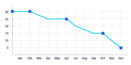
The burn-down chart is used to track progress toward project completion and provides a visual representation of the amount of work remaining over time. This chart is especially useful for agile and iterative projects, as it helps project managers track progress against sprints and releases.
PERT Chart
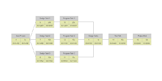
The Program Evaluation and Review Technique (PERT) chart is a type of flowchart that is used to represent the interdependencies between tasks within a project. It provides a clear visual representation of the project network, and helps project managers understand the critical path and potential impact of task delays.
Earned Value Chart
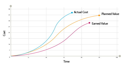
The earned value chart is used to track project performance against budget and schedule, and provides a visual representation of the value of work completed over time. This chart is especially useful for large, complex projects, as it provides a quick and easy way to understand project performance and make informed decisions about resource allocation and risk management.
Control Chart
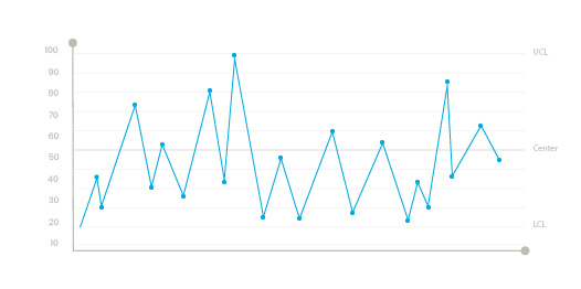
The control chart is used to monitor project performance and identify trends and patterns. It provides a visual representation of data over time, and helps project managers identify potential issues and take action to resolve them.
Stacked Bar Chart
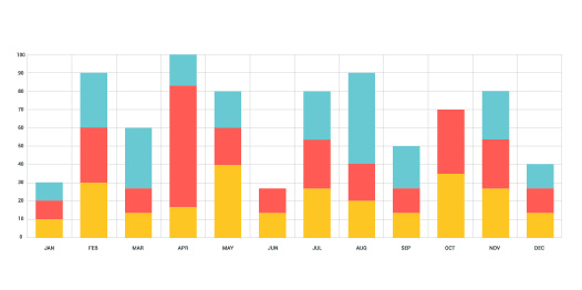
The stacked bar chart is used to represent the distribution of tasks and resources within a project. It provides a clear visual representation of the distribution of effort, and helps project managers understand resource utilization and optimize resource allocation.
Radar Chart
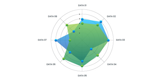
The radar chart is used to compare and contrast different aspects of project performance, such as cost, schedule, and quality. It provides a visual representation of data in a polar coordinate system, and helps project managers identify areas of strength and weakness and make informed decisions about project direction.
Pie Chart
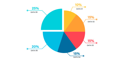
The pie chart is used to represent the distribution of data in terms of percentages. It provides a quick and easy way to understand the distribution of resources, effort, and costs within a project, and helps project managers optimize resource allocation and reduce waste.
Line Chart
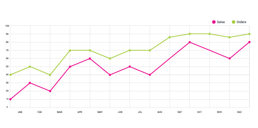
The line chart is used to represent data over time and provides a visual representation of trends and patterns. It is particularly useful for monitoring project performance and identifying areas of improvement, and helps project managers make informed decisions about project direction and risk management.
Scatter Plot
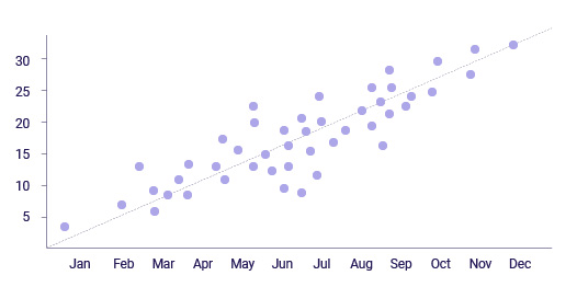
The scatter plot is used to represent the relationship between two or more variables. It provides a visual representation of the correlation between data points, and helps project managers identify patterns and trends and make informed decisions about project direction and resource allocation.
Conclusion
In conclusion, the use of charts in project management is an essential tool that provides many benefits and helps project managers to effectively plan, coordinate, and monitor projects. By providing a visual representation of complex data, charts help to improve understanding, communication, decision making, tracking, resource allocation, transparency, and risk management.
There are many different types of charts that can be used in project management software, each with its own strengths and weaknesses. The most popular charts include Gantt charts, burn-down charts, PERT charts, earned value charts, control charts, stacked bar charts, radar charts, pie charts, line charts, and scatter plots.
Whether you are a seasoned project manager or just starting out, it is important to have a good understanding of the different types of charts available and to use them effectively in your projects. By doing so, you will be able to make better decisions, communicate more effectively, and ultimately, deliver more successful projects.